

Customers come to us for many reasons: to spend less time preparing for audits and answering security questionnaires, to prove their impact to their boss and board, to log into fewer systems, to save money, to strengthen their security posture, to make it easier for their colleagues to support compliance efforts – to name a few. The data shows that we’re meeting (and exceeding) their needs, as we’ve seen tremendous growth from both our sales-led and product-led lines of business, coupled with strong renewals from our many happy, inspiring customers.
But in the year since I’ve been with TrustCloud, it became clear that anyone meeting us for the first time didn’t understand all the reasons they should work with us, and our sales team needed more support educating prospects about the value of Trust Assurance and how GRC can become a profit center.
Sounds like the right time for a brand refresh!
Based on feedback from customers and prospects, we knew the story we wanted to tell:
- GRC can be a profit center
- Trust Assurance – continuous, programmatic, predictive, AI-powered – is the next generation of compliance automation
- Trust Champions deserve to be celebrated
We could handle updating our messaging, but how to tell that story visually? We partnered with Major Studio, with support from Maggie Morris, to revisit our visual identity with a few guiding principles: adhere to the tenets of Joyfully Crafted (meticulous, approachable, human, elegant), evoke fun and playfulness, and speak to key attributes of Trust.
One of the first concepts Major shared with us was called Close Ties:

We immediately seized on the knot: it conveys strength, partnership and community. We evolved that initial design to our final logo and brand mark, with a thread that contains an infinity symbol, suggesting continuity – another key element of Trust Assurance. And our values are an acronym for THREAD. Can you believe the synergy?

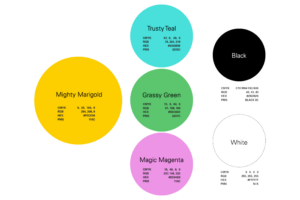
Major suggested Mighty Marigold as our primary color, which we liked for a few reasons: it stands out in an industry dominated by blue, black and gray, marigold is a celebratory hue in many cultures around the world, and marigolds are natural security agents – they release an insecticide to prevent intruders and combat threats. Perfect for a GRC platform!
The logo, mark, and colors are elegant and meticulous, but we wanted to go a step further in staying approachable, human – and hopefully, fun! From that goal, our mascot Trusty was born:

I’m so happy to celebrate the work from Major, Maggie, and my colleagues at TrustCloud, and thankful for inspiration from brands including Trello, HelpScout, Animalz, Intercom, Slite, Stripe, Segment and more. I hope this update makes you feel empowered to turn GRC into a profit center. Let us show you how!